Table of Contents
ToggleIntroduction:
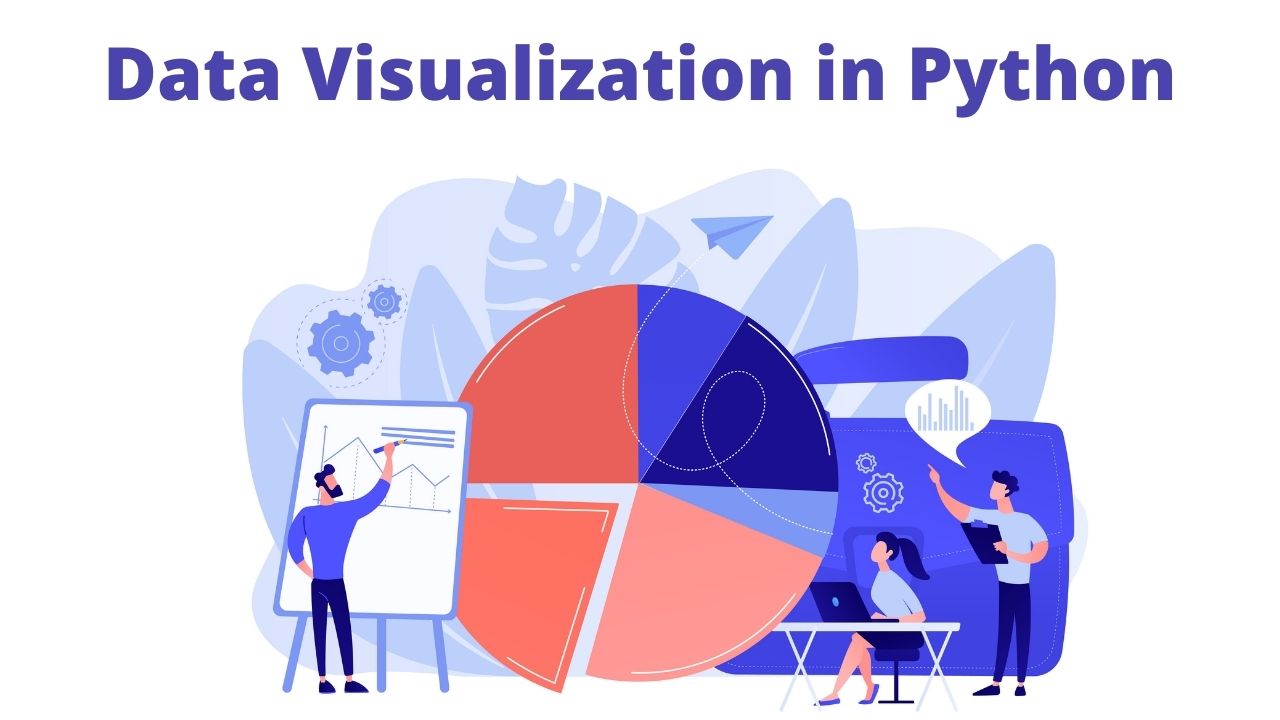
Data is exposed for retrieving the patterns and trends from it. Python has proved to be an easy tool as it offers multiple online libraries that help you to find the appropriate tools for plotting data in a customized way. Python is very important for data visualization. Python offers great libraries to perform data visualization. If you do not know about Python, then you should take some online courses to lean about it as well as data visualization.
In this article, you will read different Python libraries that offer data visualization. If you want to get the basic knowledge then keep reading this blog. Want to learn more about data science? Enroll in the Data Science Training and Placement in Bangalore to do so.
Important Python Libraries for Data Visualization
There are the following libraries of Python that support data visualization.
- Matplotlib
This is the famous library used for exposing or plotting data in patterns. This is a low-level library that is very good for creating graphs and charts. It has multiple features that allow you to represent data uniquely. Like you can install the Matplotlib and can color each class a different color to make it prominent in the data. Here you will write the coding in the scatter plot to color the data points using for loop. A line chart can be created by the plotting method where you can plot several columns in one graph. By using the hist method in Matplotlib you can create a histogram. The bar method will be used to create bar charts that are beneficial for categorical data.
- Pandas Visualization
This is an open-source python library that allows easy usage and also provides different data analysis tools for data visualization. It is very easy to create plots by using data frames. It also offers a high-level API than found in the Matplotlib. So you will need to write less code for similar outcomes. A scatter plot can be created by calling and passing arguments. In Matplotlib you are required to loop for creating line charts but in panda’s visualization, you do not need to do it. As told earlier that you will get the same results with fewer coding statements than Matplotlib. Earn yourself a promising career in data science by enrolling in the Data Science Training in Hyderabad offered by 360DigiTMG.
- Seaborn
This is the Python data visualization library that is based on the concepts of Matplotlib. But it provides a high-level interface for creating graphs. Here you can create graphs by only writing one statement of python coding. It also offers you to work by using the data frames of Pandas data visualization. Just pass the names of the column to create a scatter plot. The hue argument can be used to highlight the points of the class. The histogram can be created by passing the argument to the column for which you want to plot. All the things will be done by it. Looking forward to becoming a Data Scientist? Check out the Data Science Course and get certified today.
All of three libraries mentioned above are the basic and most popular data visualization python libraries that will teach you from the basics to the core concepts. You can join one of the data visualization libraries to get experience.
In this way, you will have a grip on the tools of data visualization. Moreover, they will also be a great source for you to get a high-paying job.
Also, check this Data Science Course in Chennai to start a career in Data Science.
Navigate To:
360DigiTMG – Data Science, Data Scientist Course Training in Bangalore
Address : No 23, 2nd Floor, 9th Main Rd, 22nd Cross Rd,7th Sector, HSR Layout, Bangalore, Karnataka-560102.
Phone : 1800-212-654321
Email : enquiry@360digitmg.com
Get Direction: Data Science Training